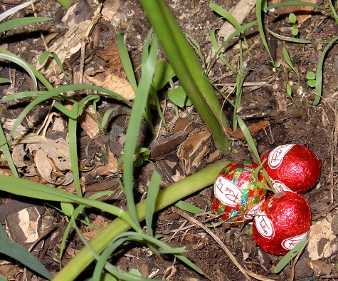
Hey, J made us a new masthead. (She’s very creative.) To be precise, she made us a whole new template – which was lovely – and then I went and messed with it. So much so that I now suspect she’d probably be embarrassed if I said it was her work. It mixes sans and serif, see. She would never do that. (See comments.)
But in any case – thanks, J. Happy Easter.
In other news: I decided to drop out of Uni again after all; census day be damned. It was silly and it was doing my head in.


No, no silly. Serifed & sans are fine to mix, if done intelligently. (Your choices qualify.) It’s when you get into mixing two types of serifs that you run into trouble with the font police.
(Which you’ve technically done, but the masthead doesn’t really count.)
(Mort aux vaches!)
I do think you have too many shades of blue going on in yer links scheme, tho. I’d make your visited-link color (i.e., the one that matches your post titles) your regular link color, and your hover color also your visited-link color.
If, y’know, it was my blog.
That’s what I would do.
But really, it looks lovely. I approve of your tinkering.
(Happy Easter 🙂
I’d make your visited-link color (i.e., the one that matches your post titles) your regular link color, and your hover color also your visited-link color.
I know; that’s how you had it before. The new blue doesn’t really go. But the pale blue looked too pale. Maybe I’ll change it back.
It’s good to have a distinctive hover colour though.
Nerd love.
Nerd love.
The best kind!
(I like the revised scheme — tis perfect 🙂
You always have nice pictures, Teigs. Incidentally, I’m back online at home. Skype will have to wait til I’m out of this artmaking disaster pit of hell thing. Be out by Thursday, probably.
Lookin’ good.